50th Anniversary Publication - The Grimsby Public Art Gallery
Challenge: Cover Art creation + publication Art Direction
Outcome: A beautiful look at the journey of GPAG’s last 50 years, growing from a small community-driven initiative into a respected institution with regional and national reach while capturing Grimsby’s people, stories, and creative spirit.


After initial discussions with the client and determining the direction the project needed to go in, we started right away with developing the cover art.
The cover was created first to help introduce the publication and launch pre-sales at GPAG’s largest annual event.
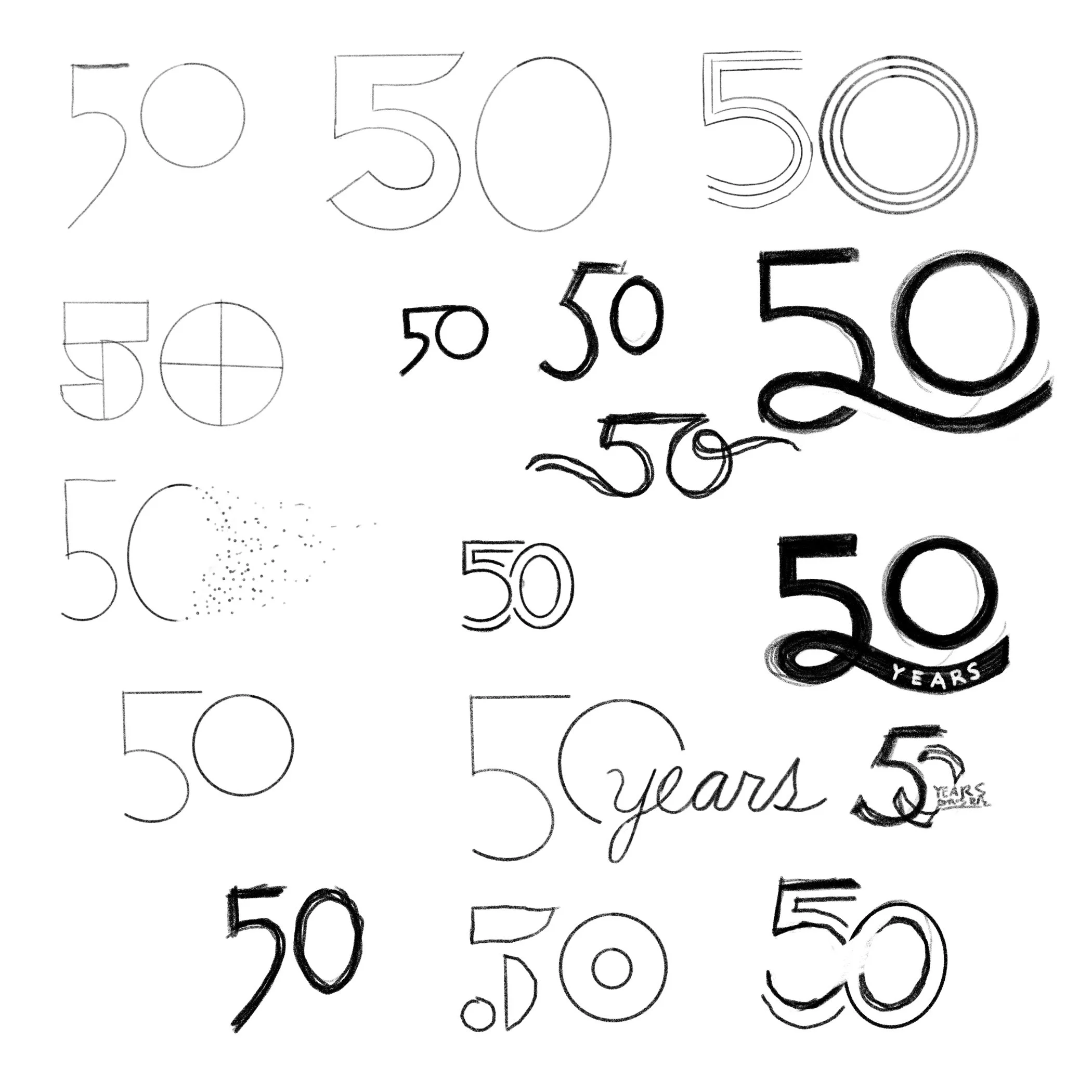
Below are exploratory sketches aiming to pull a bit of inspiration from the 70’s, yet still felt contemporary and sophisticated like the gallery itself

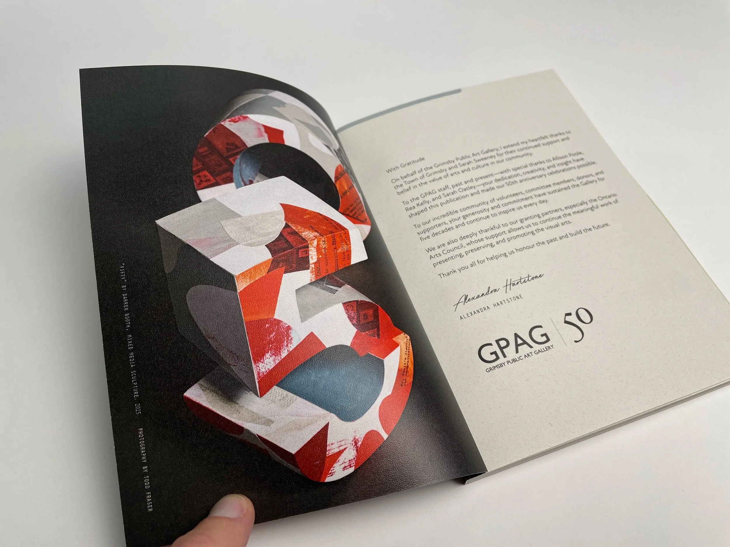
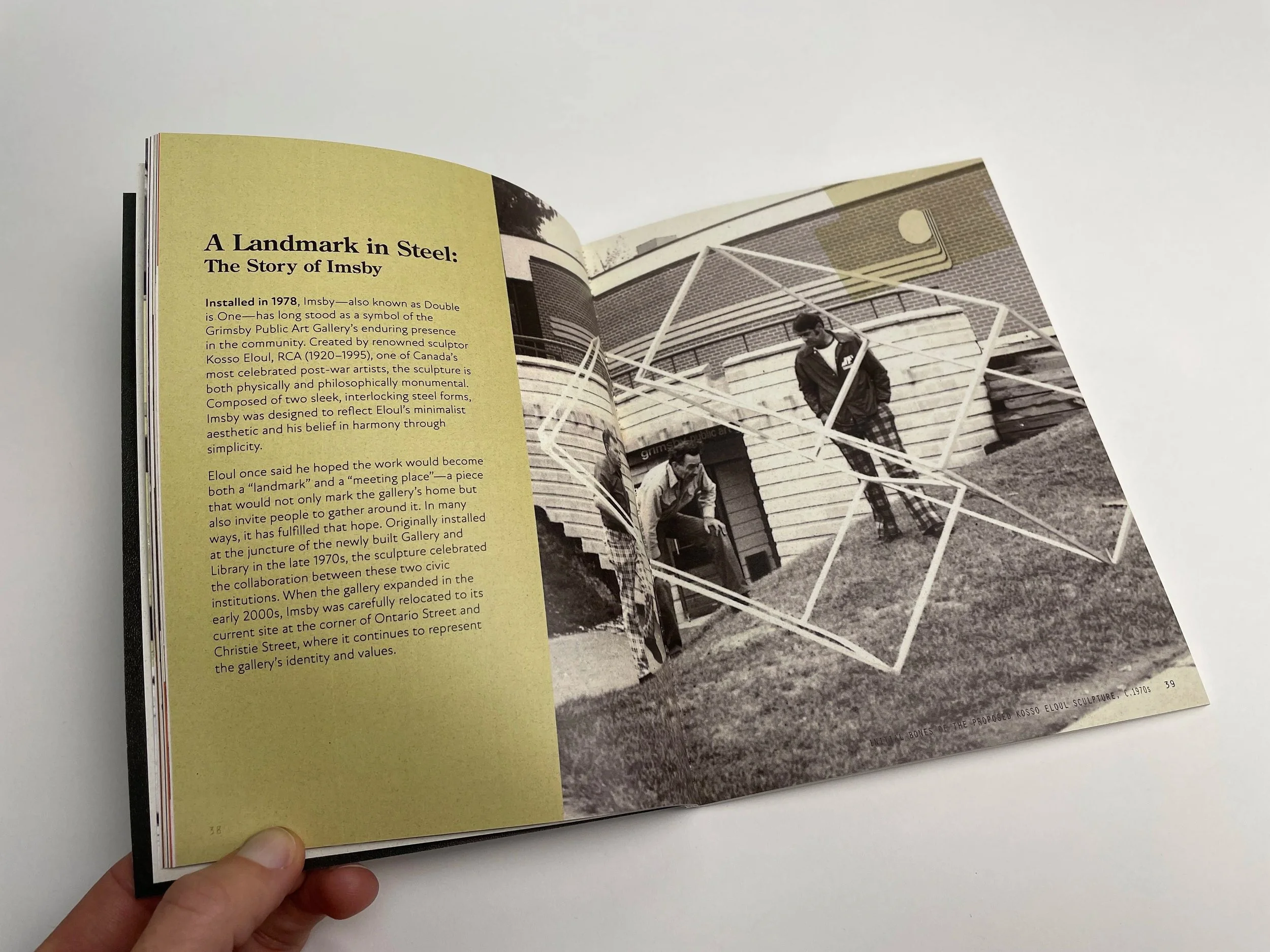
Below: The installation of the Kosso sculpture out front of the gallery in the 1970’s. We paid particular notice to the forms of the sculpture being offset and blocky. This informed the lettering by leading us down the path of making it 3D and slightly offsetting the pieces it as a gentle nod to the Kosso sculpture.

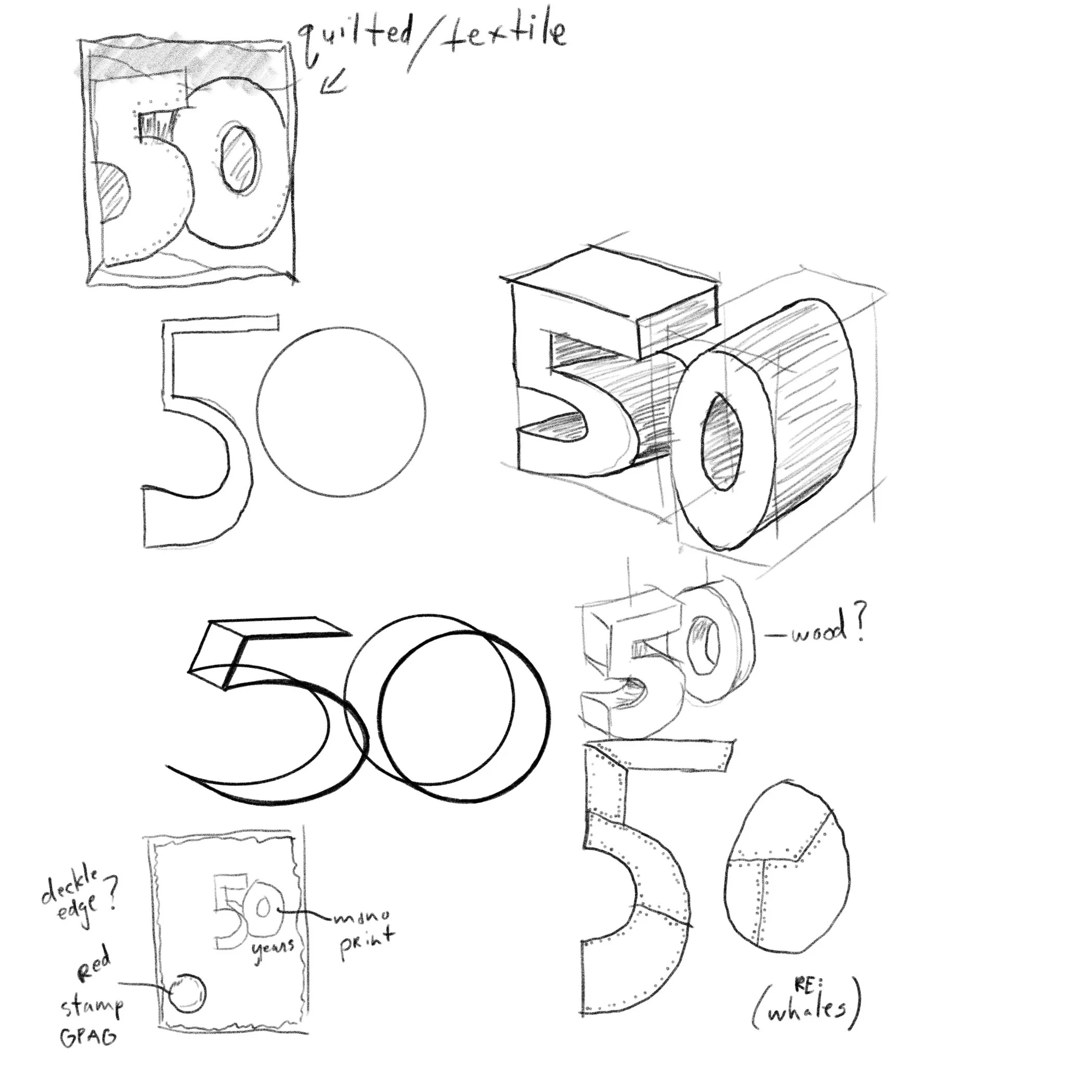
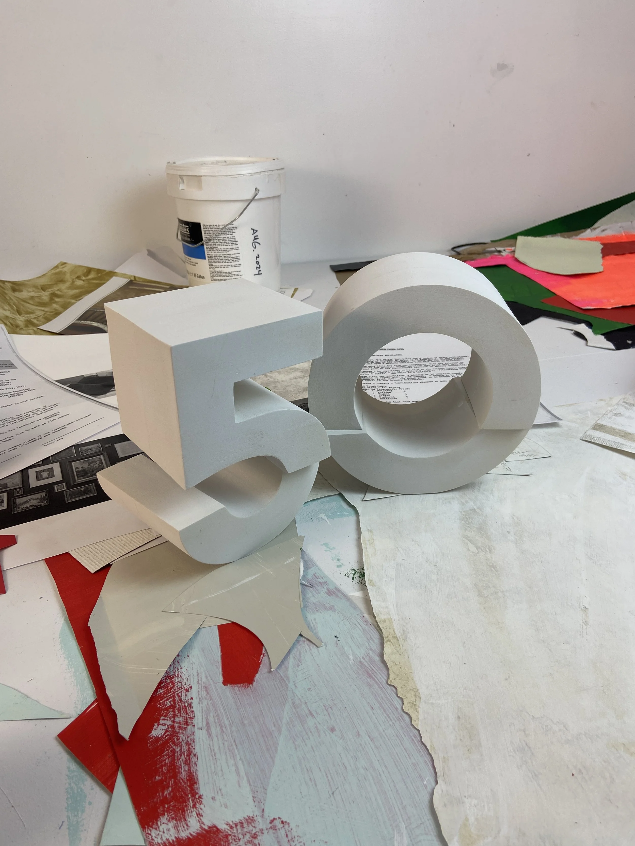
In order to help figure out the depth it needed to be, I created it in 3D with the intention of using augmented reality to help visualize and test. Knowing that it would eventually be painted and collaged with archival materials from the gallery, I needed to determine what size to fabricate it. If the piece is too large or too small, the collage elements create unnecessary challenges.

Augmented Reality
Years ago I did an AR Artist Residency with Adobe and ever since then I’ve used it as a tool for quick iterations and testing of scale, depth, etc…
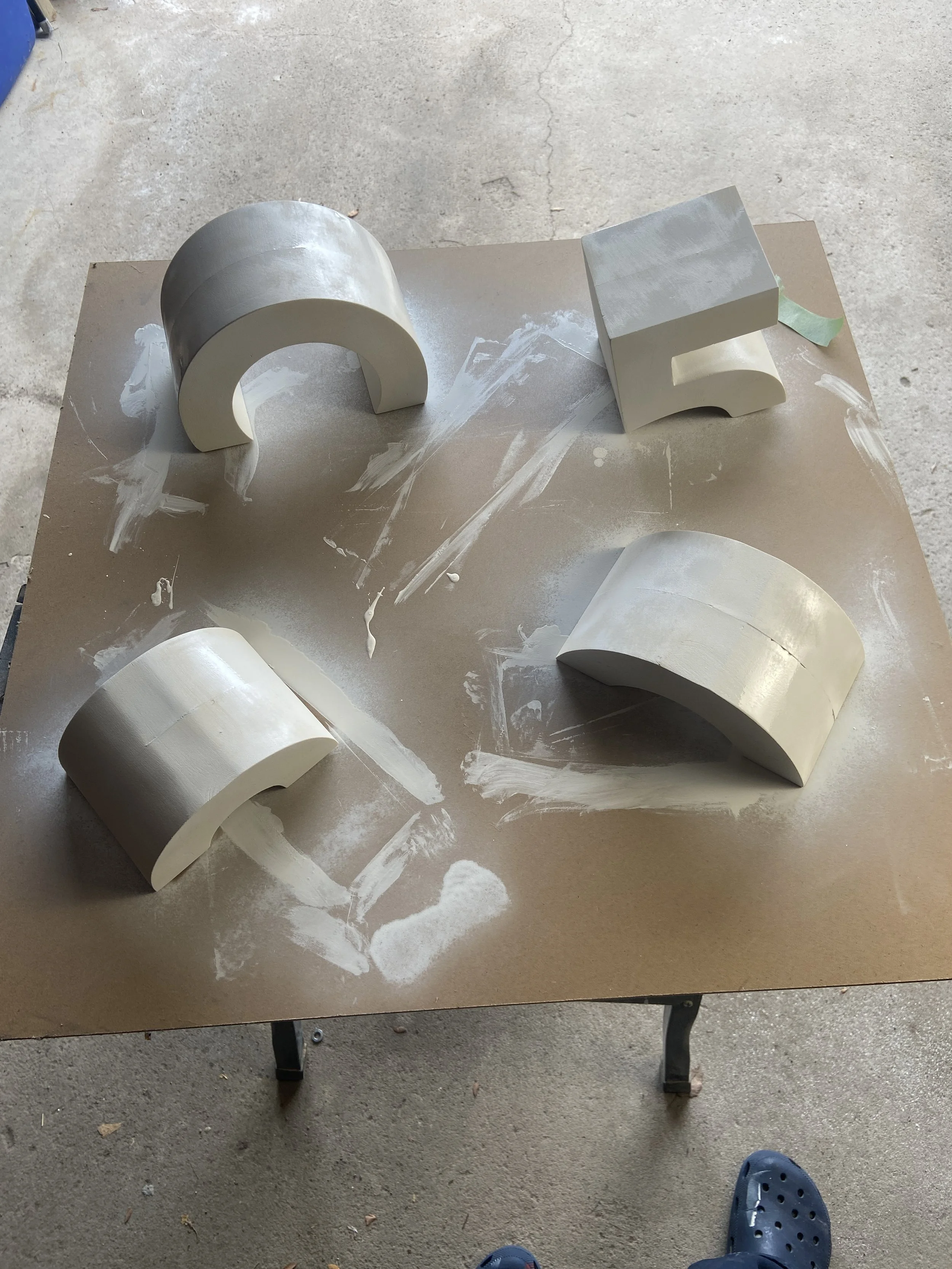
Sanding & Priming
The forms were fabricated using High Density Urethane, which can be pretty toxic, hence the masking up. HDU is often used by sign makers as it’s lightweight, solid, and also takes paint well. So it was the perfect option for this project.

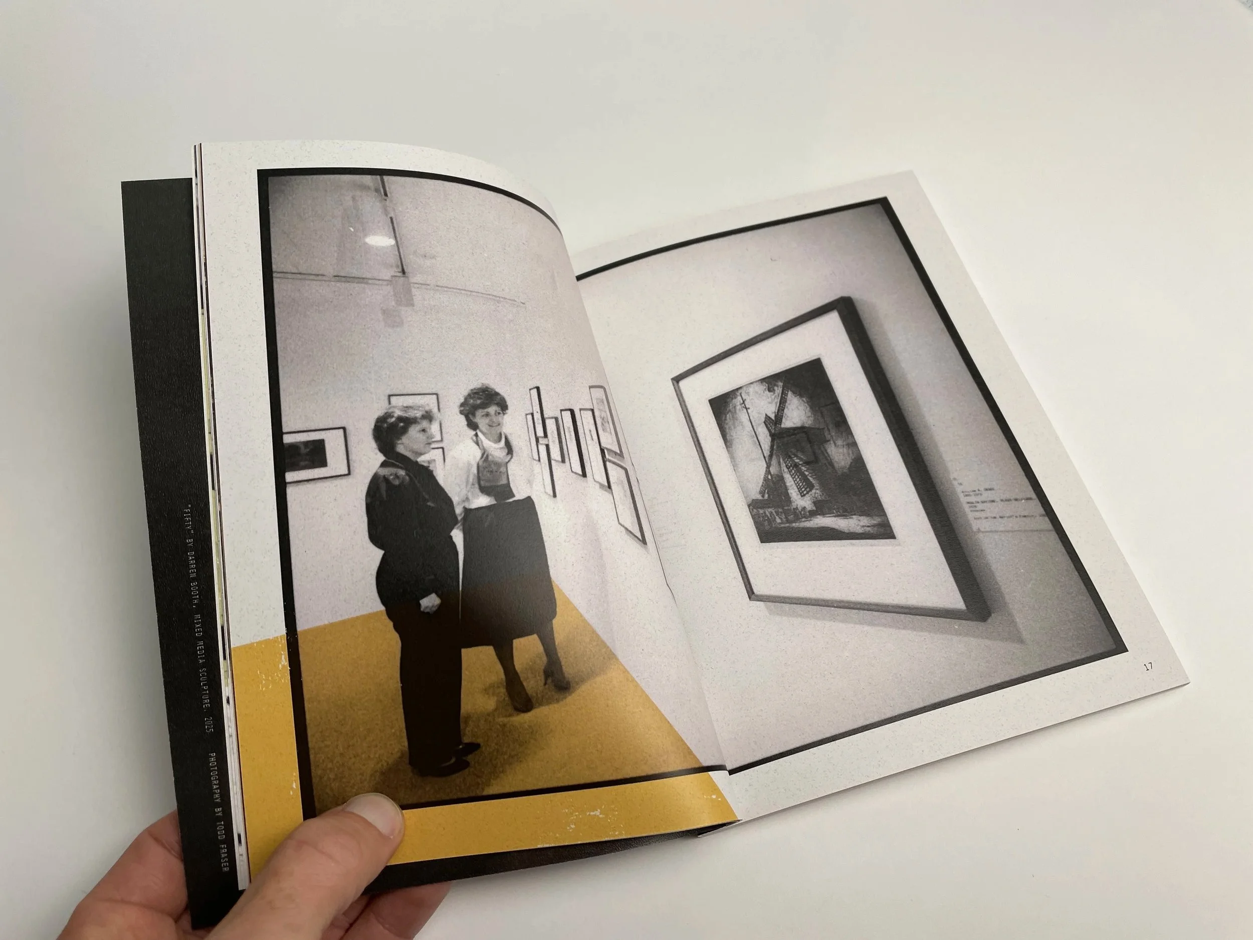
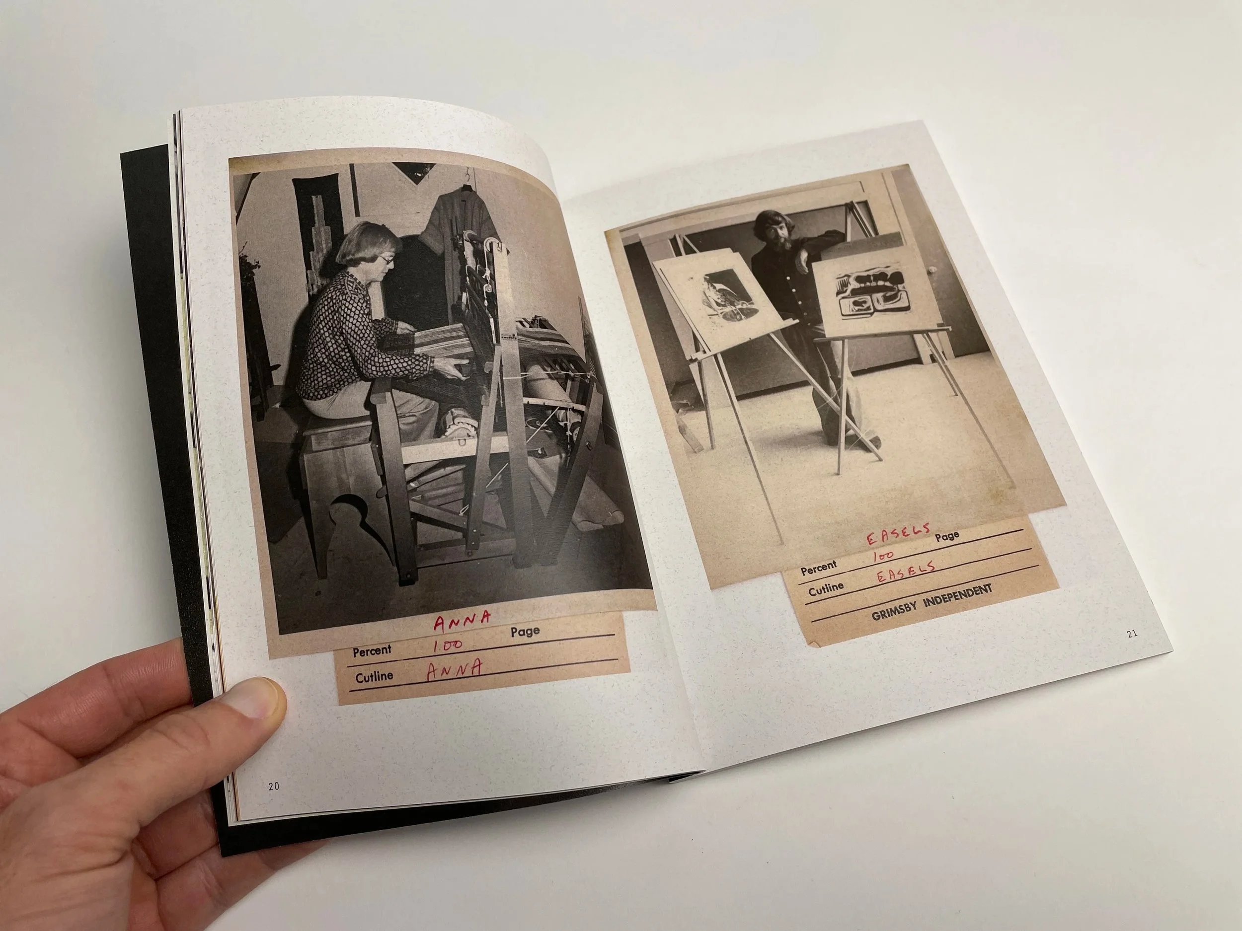
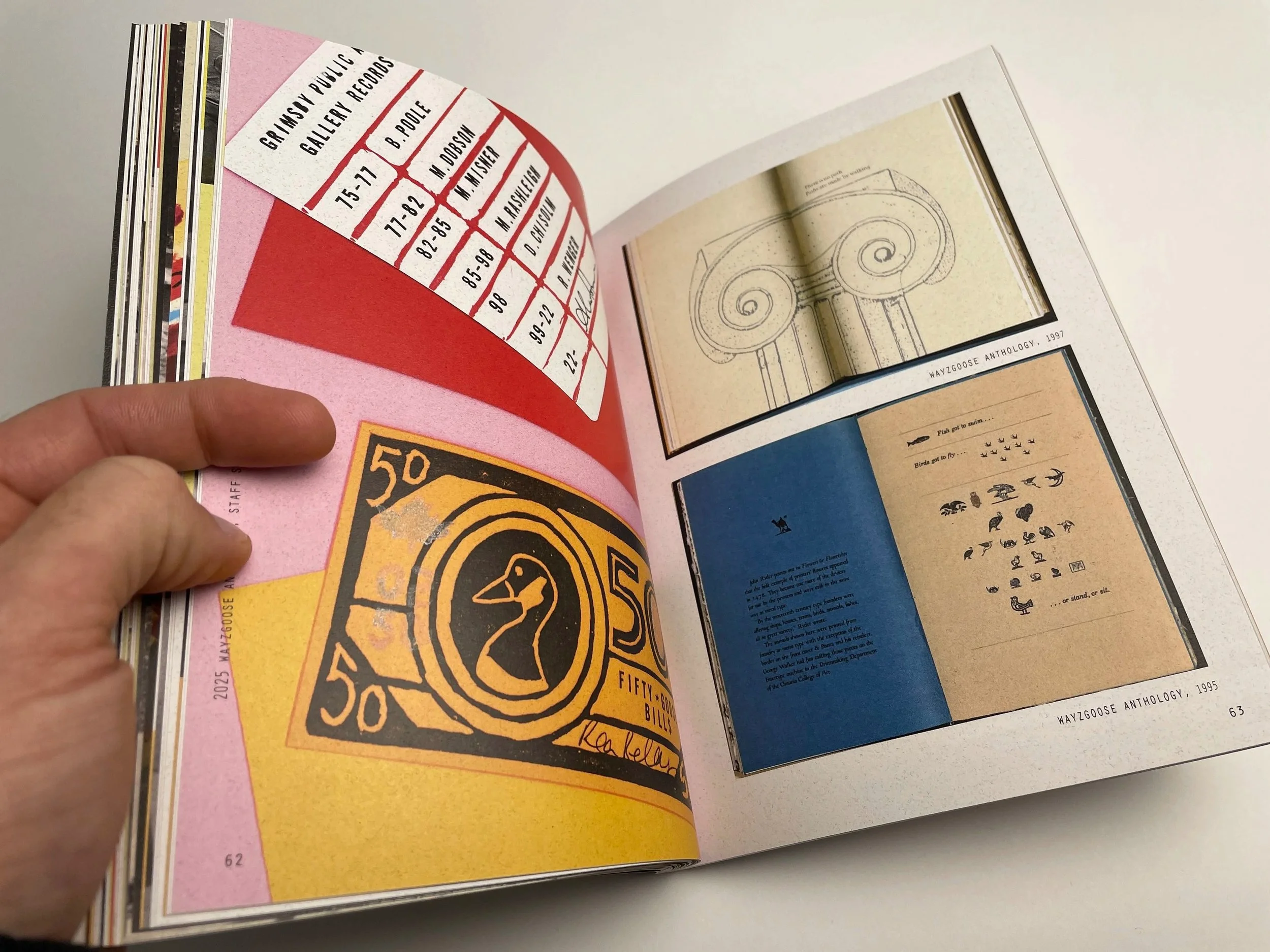
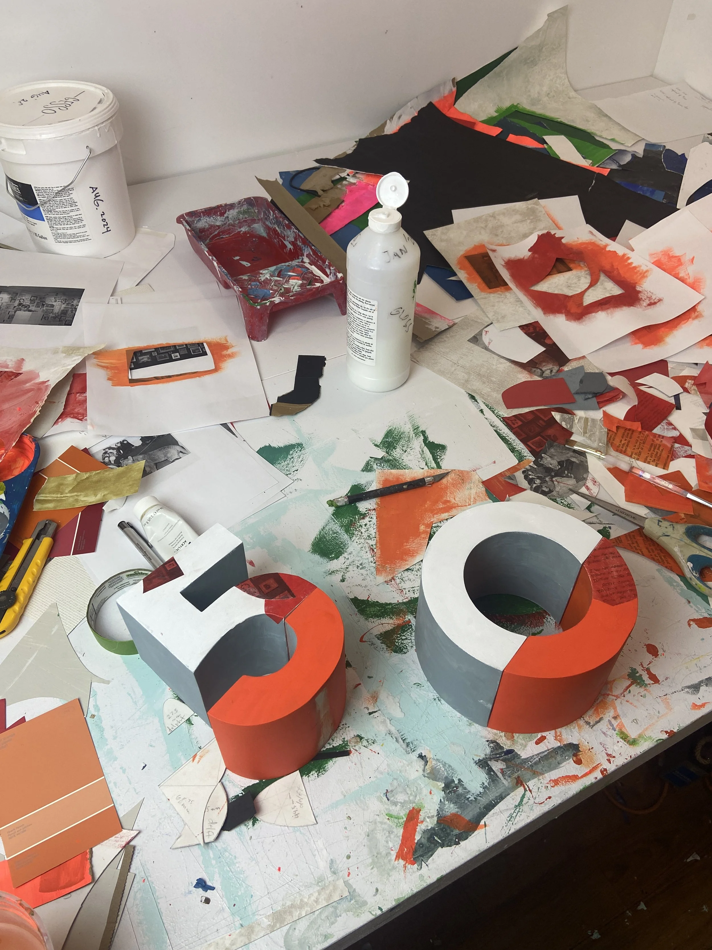
Then it was time to start painting and collaging using some archival elements provided by the client, such as early photos of March Break camps (ie the lion cub from photos), meeting notes, and even some hate mail!

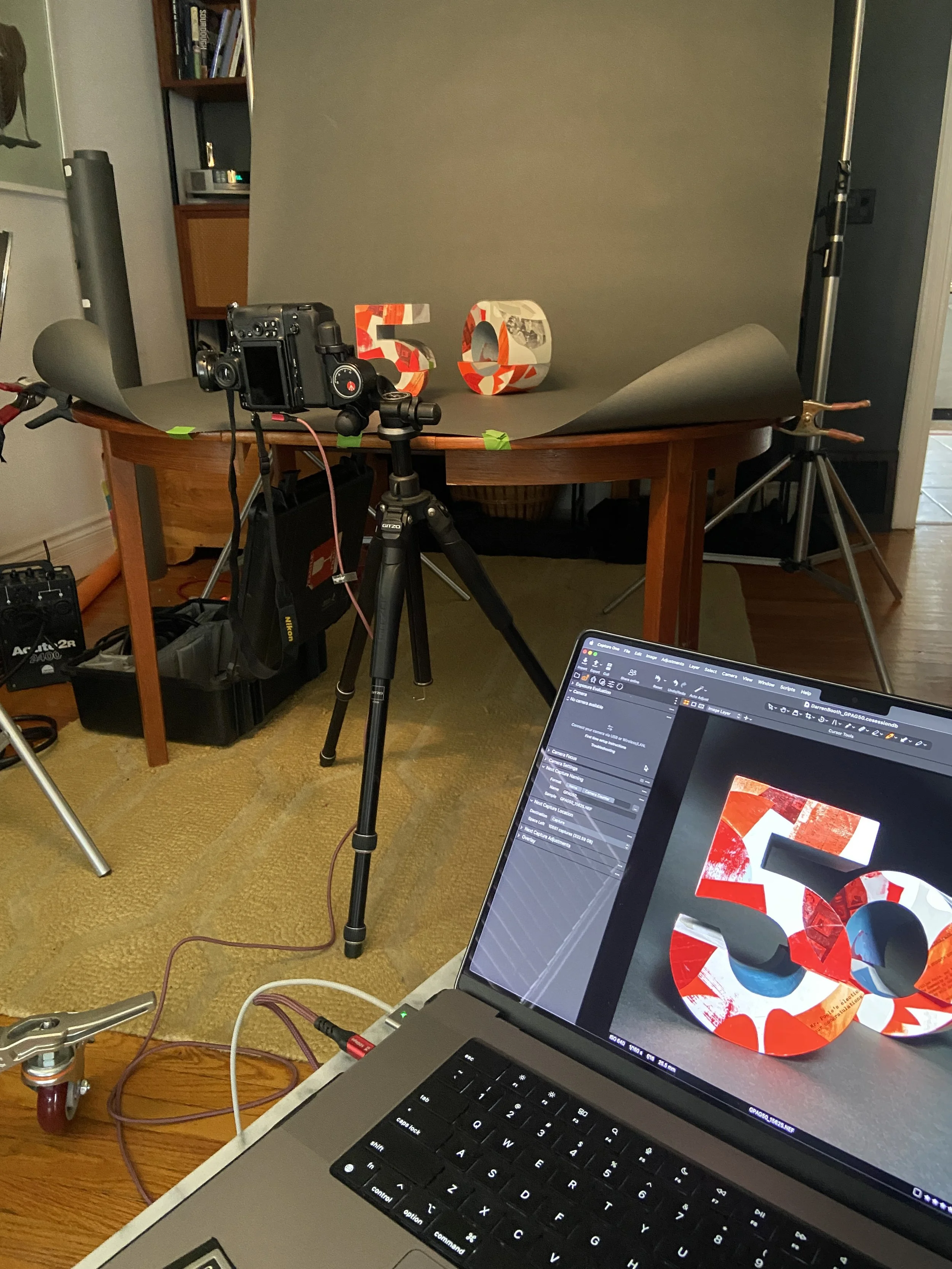
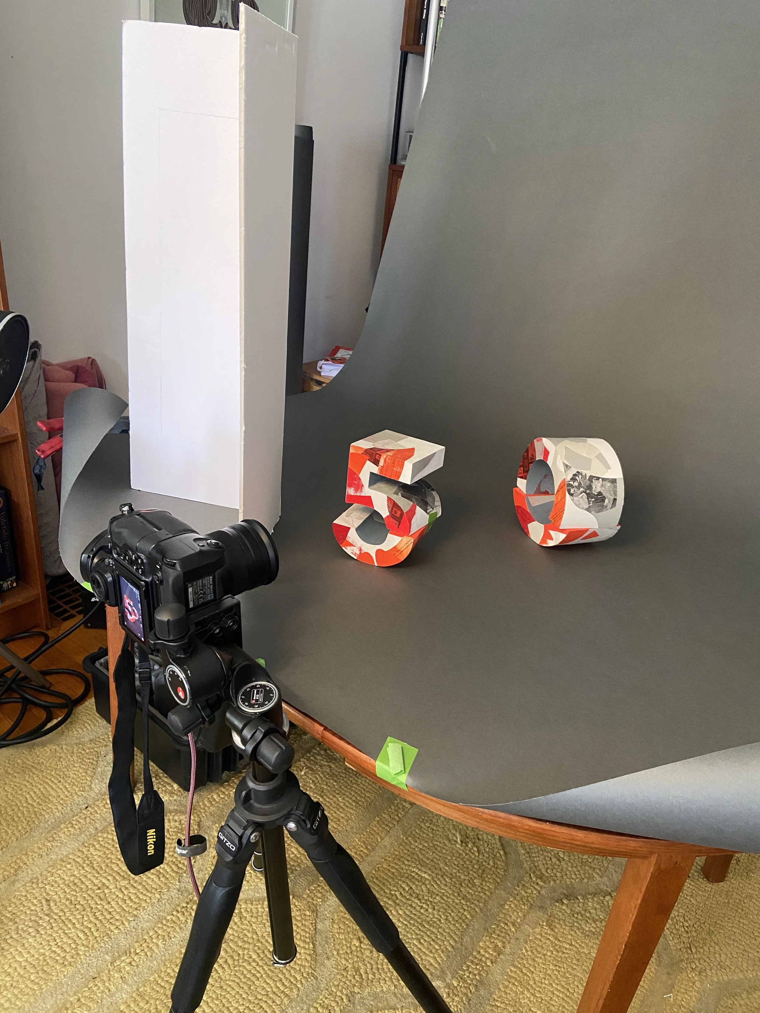
From there we photographed the work, working with Todd Fraser.
Then it came time to designing the rest of the publication where Tim Alblas worked his magic.